How to Choose the Perfect Color Palette for Every Room
A Complete Guide to Creating a Beautiful, Balanced and Harmonious Home Interior

Choosing the perfect color palette for every room is one of the most important decisions in home design, as color directly influences mood, comfort, energy and overall atmosphere. The right colors can make a small space feel bigger, a dark room appear brighter and a simple interior look elegant and stylish. On the other hand, poor color choices can make even the most expensive furniture look dull and out of place. A well planned color scheme brings harmony, flow and balance to your entire home. By understanding how colors interact with light, space and emotions, you can design rooms that feel welcoming, functional and visually appealing.
Understanding the Role of Color in Interior Design
Color is more than just decoration; it plays a psychological role in shaping how we experience a space. Warm colors like red, orange and yellow create feelings of warmth, energy and comfort, making them suitable for social spaces. Cool colors such as blue, green and purple promote calmness, focus and relaxation, making them ideal for bedrooms and work areas. Neutral tones like white, beige, gray and cream serve as a versatile base, helping to balance bold shades and create a timeless look. Understanding these effects helps in selecting colors that match both the function and emotional purpose of each room.
Matching Colors with Room Function
Every room in your home has a specific purpose and the color palette should support that function. Living rooms should feel warm and inviting, encouraging conversation and relaxation. Bedrooms need calming and soothing tones to promote rest and sleep. Kitchens and dining areas benefit from fresh, energetic colors that stimulate appetite and activity. Home offices require shades that enhance focus and productivity, while bathrooms should feel clean, bright and refreshing. When color choices align with how a room is used, the entire space feels more natural and comfortable.
Considering Natural and Artificial Lighting
Lighting significantly affects how colors appear in a room. Natural sunlight can make colors look brighter and more vibrant, while artificial lighting can change their warmth or coolness. North facing rooms usually receive cooler light, so warm shades help balance the atmosphere. South facing rooms get abundant sunlight, allowing cooler colors to work beautifully. East facing rooms feel bright in the morning and softer later in the day, while west facing rooms glow warmly in the evening. Observing how light interacts with your walls throughout the day ensures you select colors that remain pleasing at all times.
Choosing Colors Based on Room Size and Layout
The size and layout of a room also influence color selection. Light colors reflect light, making small rooms feel more spacious and open. Dark colors absorb light, creating intimacy and warmth in larger spaces. If a room feels narrow or cramped, pale shades like soft white, light gray or pastel tones can visually expand it. For large or open spaces, deeper colors can add character and prevent the area from feeling empty or cold. Strategic color placement can even alter how the room’s shape is perceived, making it appear taller, wider or cozier.
Creating a Cohesive Whole-House Color Scheme
A home feels most beautiful when all rooms flow smoothly from one to another. While each room can have its own personality, the overall color palette should remain cohesive. Choosing a neutral base color for the entire home helps maintain consistency, while accent colors can vary slightly in each space. This approach creates harmony and prevents the interior from feeling disjointed. A well connected color scheme enhances visual comfort and gives the home a polished, professional appearance.
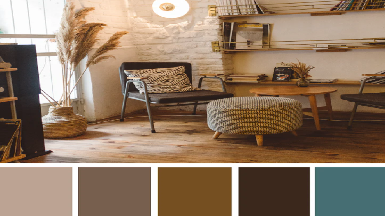
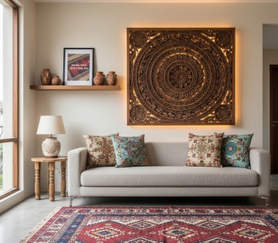
Selecting Colors for Living Rooms
Living rooms are social spaces where family and guests gather, so the color palette should feel warm, welcoming and comfortable. Soft neutrals like beige, warm gray and cream create a calm base that complements various furniture styles. Earthy tones such as olive green, muted brown, soft terracotta and dusty blue add warmth and depth. Accent colors through cushions, rugs and artwork can enhance personality without overwhelming the space. The goal is to design a living room that feels cozy, stylish and inviting at all times.
Choosing the Perfect Colors for Bedrooms
Bedrooms should serve as peaceful retreats that encourage relaxation and restful sleep. Soft, cool colors like light blue, pale green, lavender and gentle gray are excellent choices. These shades reduce stress and promote calmness. Warm neutrals like soft beige and creamy white also create a soothing environment. Darker tones can be used carefully for accent walls or furnishings, adding sophistication without overpowering the room. Balanced lighting and gentle contrasts further enhance the relaxing effect.
Color Ideas for Kitchens and Dining Areas
Kitchens are lively spaces that benefit from fresh, clean and bright colors. White remains a popular choice because it reflects light and creates a sense of cleanliness. Light gray, soft green, pale yellow and warm beige add warmth and energy. For dining areas, warm tones encourage appetite and conversation. Subtle shades of orange, peach, muted red and earthy brown help create a cozy and social dining atmosphere. Combining neutral bases with colorful accents ensures a balance between function and style.
Designing Calm and Fresh Bathrooms
Bathrooms should feel clean, refreshing and relaxing. Light shades like white, soft gray, pale blue and gentle green give a spa-like ambiance. These colors enhance brightness and create a feeling of hygiene. Natural textures such as wood, stone and greenery pair beautifully with these tones, adding warmth and elegance. Small touches of color through towels, accessories or tiles can introduce personality without cluttering the space.
Enhancing Focus in Home Offices and Study Rooms
Home offices and study rooms require colors that promote concentration and mental clarity. Soft neutrals combined with light blues or gentle greens help reduce eye strain and support productivity. Warm accent tones can boost creativity and motivation. Balanced lighting, minimal distractions and a harmonious color palette together create an environment that improves focus and work efficiency.
Creating Fun and Inspiring Children’s Rooms
Children’s rooms should be cheerful, playful and stimulating while remaining comfortable. Soft pastel shades combined with bright accent colors create a joyful atmosphere. Neutral bases allow flexibility as children grow and their preferences change. Using colorful accessories, wall art and furniture ensures creativity without overwhelming the senses. A balanced palette helps create a nurturing and inspiring environment.
Testing Colors Before Final Decisions
Paint colors can look very different on walls than on small sample cards. Lighting, surface texture and surrounding colors all affect how a shade appears. Testing paint samples on your walls and observing them at different times of the day helps avoid costly mistakes. This simple step ensures satisfaction and confidence in your final choice.
Essential Tips for Choosing the Perfect Color Palette
- Understand room function and emotional purpose
- Observe natural and artificial lighting
- Use light colors to enlarge small spaces
- Maintain flow and cohesion across rooms
- Apply the 60-30-10 balance rule
- Test paint samples before finalizing
- Combine colors with textures and materials
By carefully considering space, light, function and personal taste, you can create a color palette that enhances every corner of your home. The right colors bring harmony, comfort and beauty, turning ordinary rooms into extraordinary living spaces that reflect warmth, elegance and personality.
Nepali Patterns in Modern Home Design: Top Interior Trends for 2026
Small Space, Big Impact: Design Tips for Compact Homes


-1745569762.jpg)
-1745569762.jpg)
-1745569769.jpg)
-1745569771.jpg)